Watch Application Components
The SiFli Software Development Kit provides UI components for watch applications, helping users develop features similar to the Apple Watch complications. It includes APIs for creating the following components:
Circular Small The circular small template displays a small image or several text characters. It appears in the corner of the watch face (for example, on a colored dial).
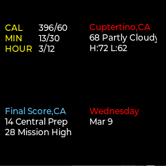
Modular Small The modular small template displays two stacked lines, composed of an icon and content, a circular image, or a larger item (for example, the bottom complication on a modular dial).
Modular Large The modular large template provides a large canvas, capable of displaying up to three lines of content (for example, in the center of a modular dial).
Utility Small The utility small template occupies a rectangular area in the corner of the dial (for example, in Chronograph or Simple dials). Content can include glyphs or icons, or a circular image.

Extra Large The extra large template displays larger text and images (for example, on an X-Large dial).
Graphic Bezel The graphic bezel template displays a graphic circular template with optional text around the bezel on an Infograph dial. The text can fill nearly 180 degrees of the bezel before being truncated.
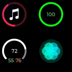
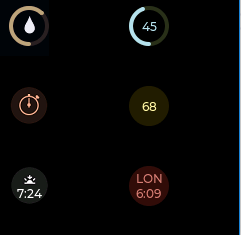
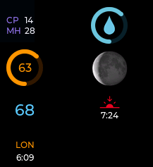
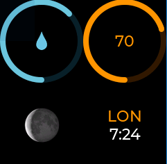
Graphic Corner The graphic corner template displays full-color images, text, and gauges in the corners of the Infograph dial. Some templates also support multi-color text.
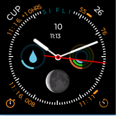
Graphic Circle The graphic circle template displays text, gauges, and full-color images in small circular regions on the Infograph and Infograph Modular dials. Some templates also support multi-color text.